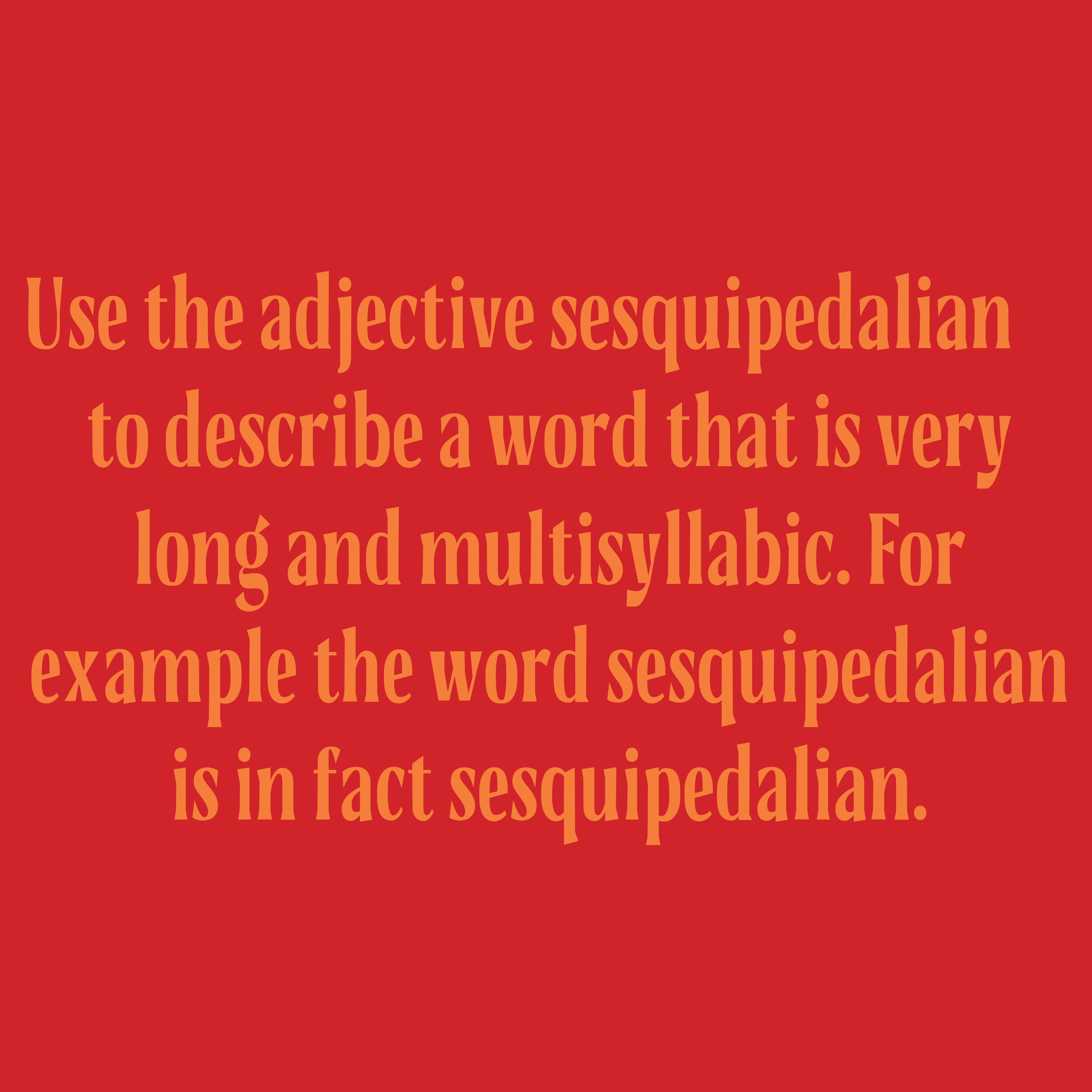
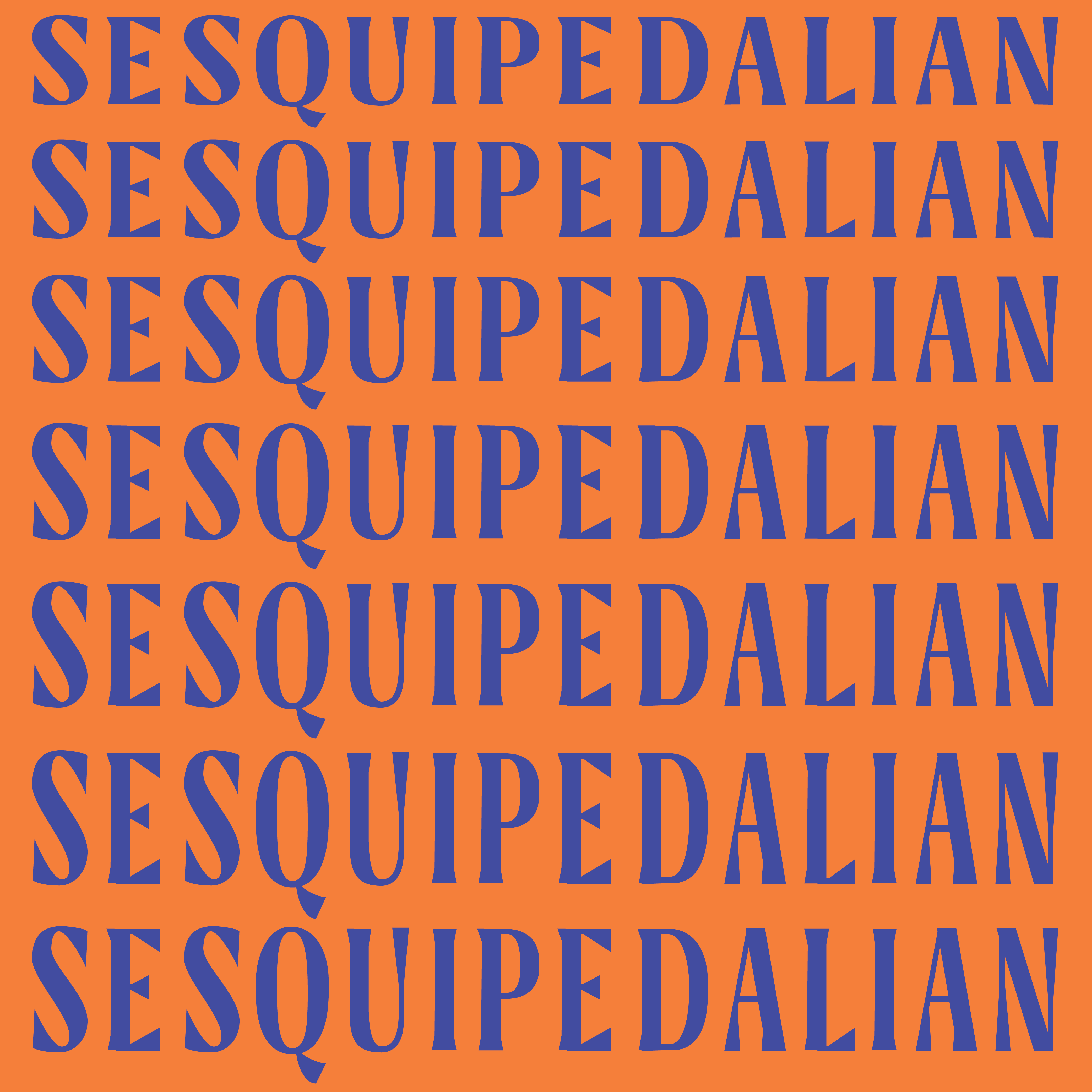
Sesquipedalian typeface design
Designed during my time taking a Type Electives course. In my experience in book and digital design I noticed that much of what we design ends up on a vertical space, scrolling on phones, viewing posters,flyers, letters, and book covers, these applications show that there is a lot of need for narrow typefaces, so I wanted to make something narrow, but also bold and beautiful for use in display, as if someone wanted to make a long word as big as possible, and a high x-height, so that it can be stacked. This is now featured on displaytypedesign.com


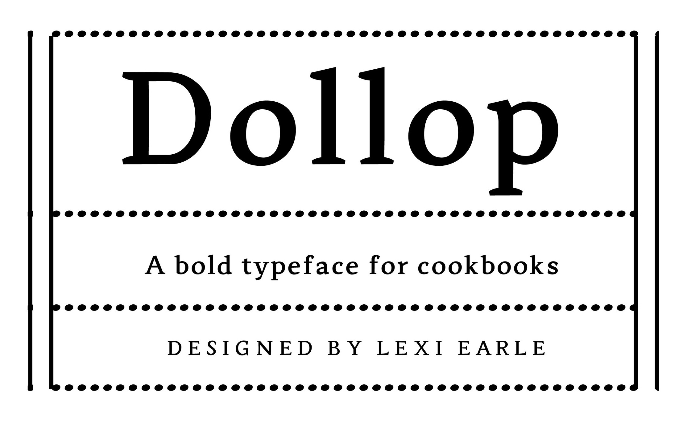
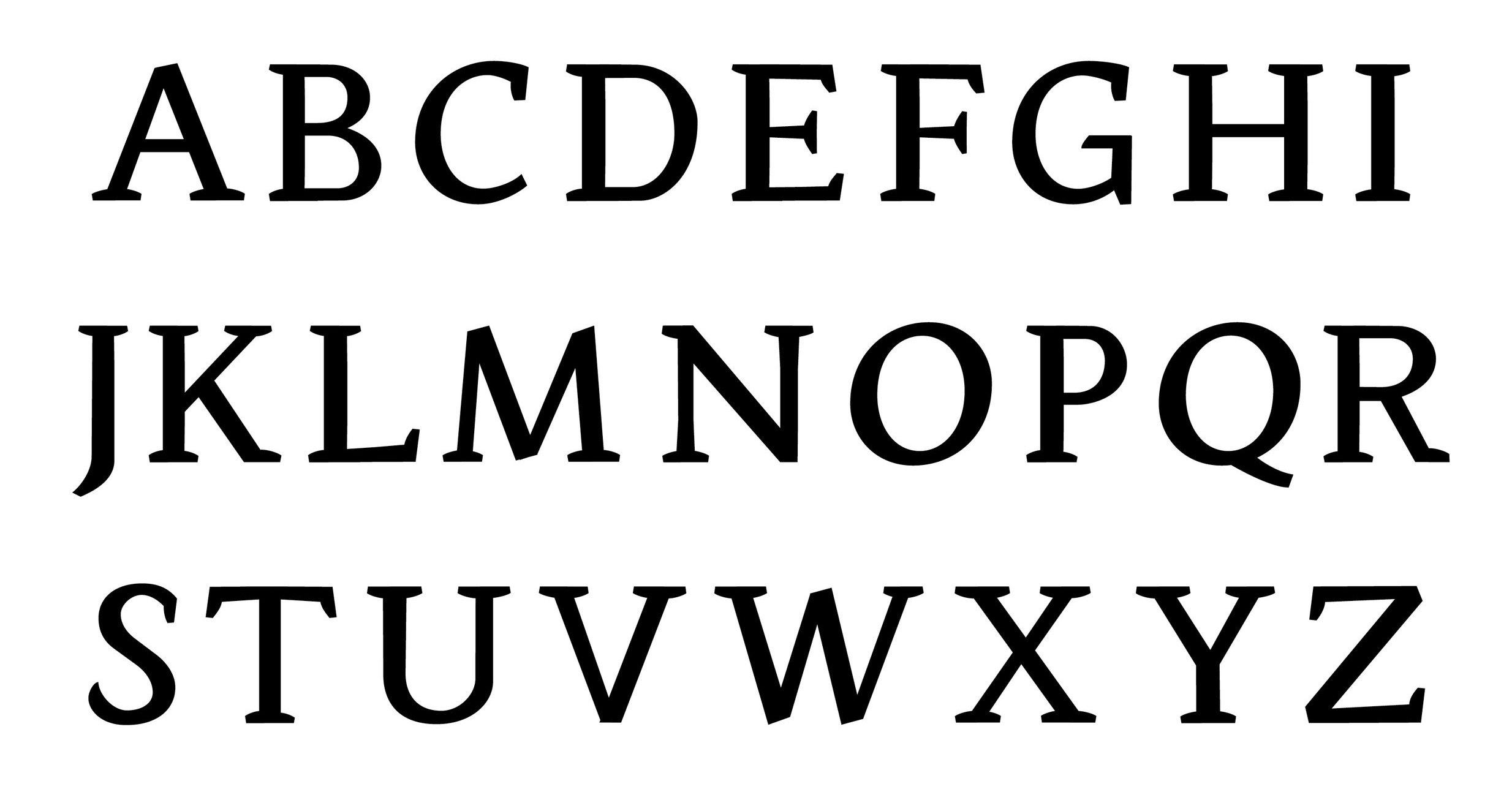
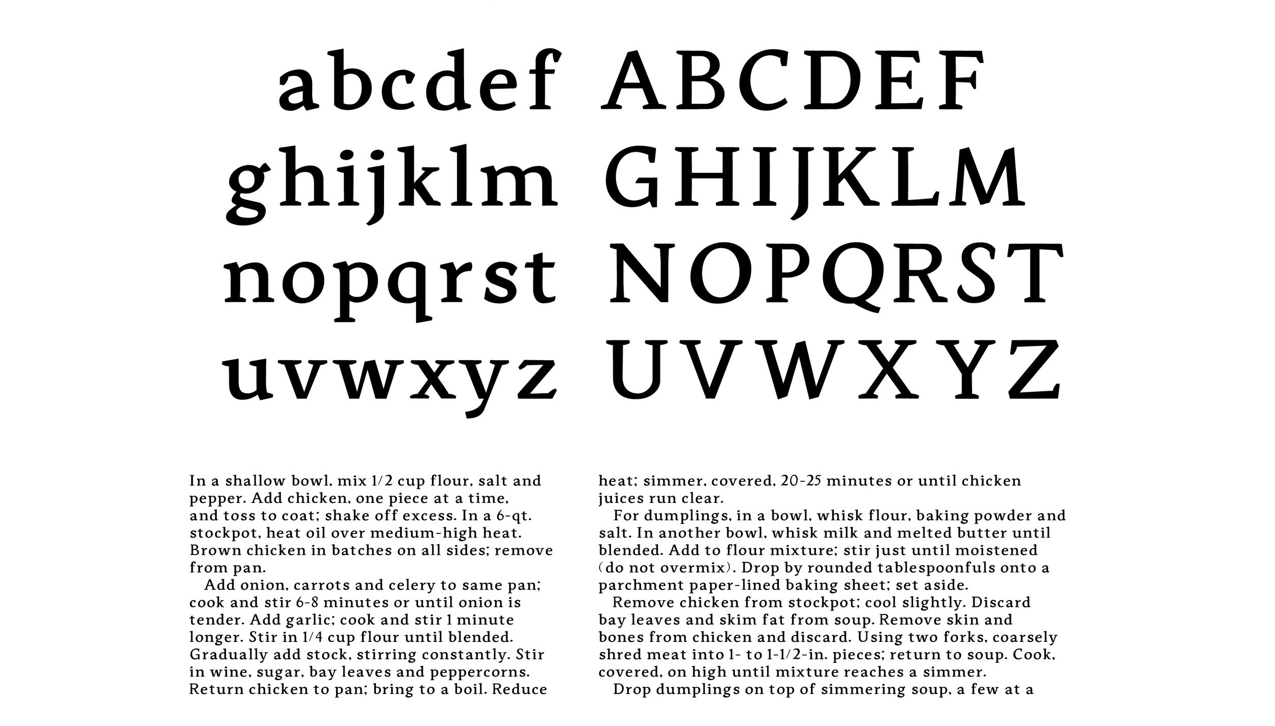
Dollop typeface design
Designed during my time at Type@Cooper, I was imspired by cookbooks, and created a text typeface optimized for cookbookuse, witha serif that rises like dough giving it a unique approachable character