Superbird
As the Lead designer at Casa Komos Beverage Group I have been managing, designing and art directing for the brand Superbird. A bold smooth and tasteful tequila brand offering smooth bottled tequila, as well as canned cocktails.
Brand Guidelines
When I joined the team at CKBG I was tasked with building out the brand book for Superbird and building the brand. The logo and packaging existed, and there was some verbal understanding of the brands vision but it needed to be defined. I created the guidelines for the brand and built revised it as we worked more with the brand.
Partnership with Tampa Bay Rays
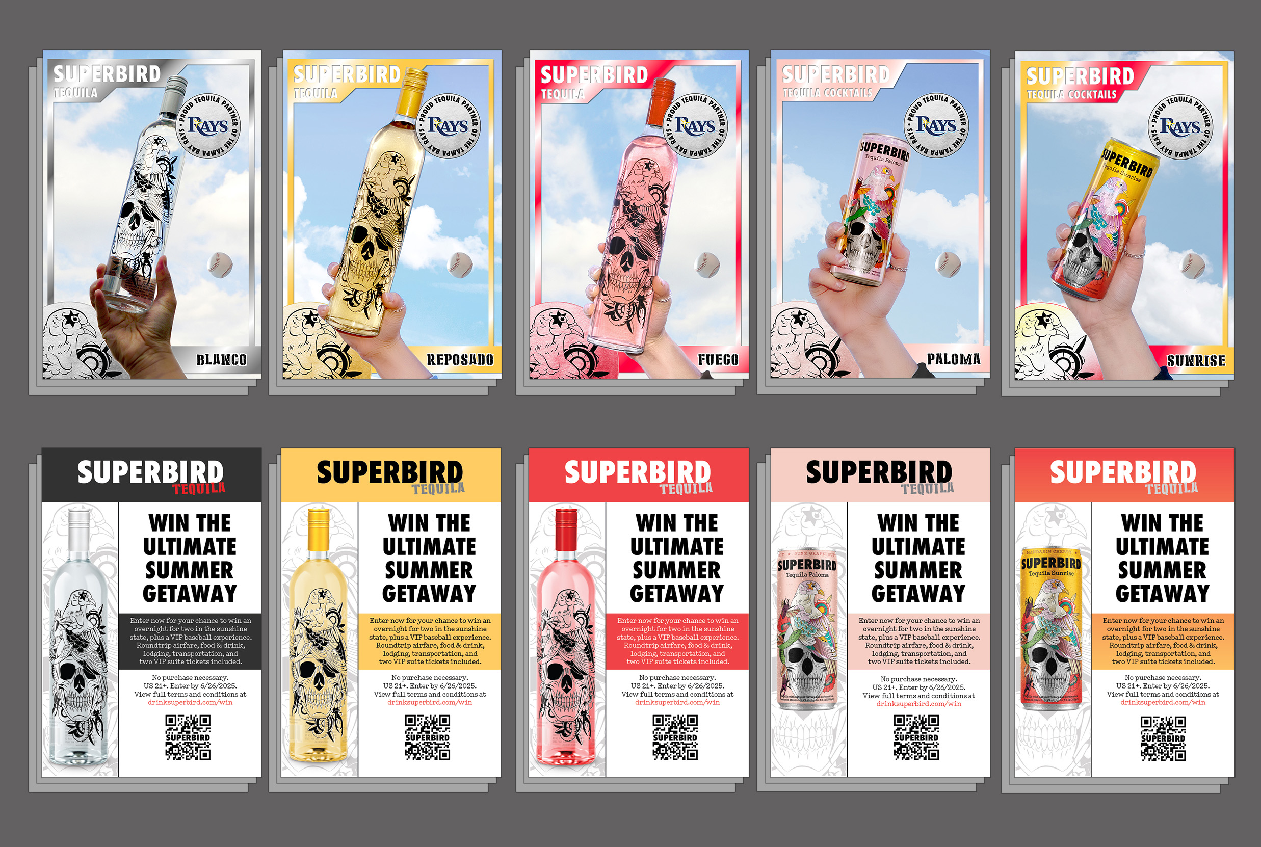
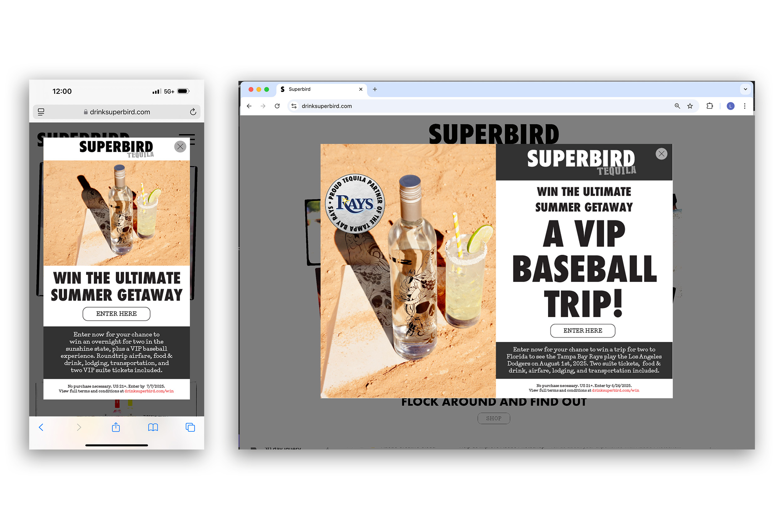
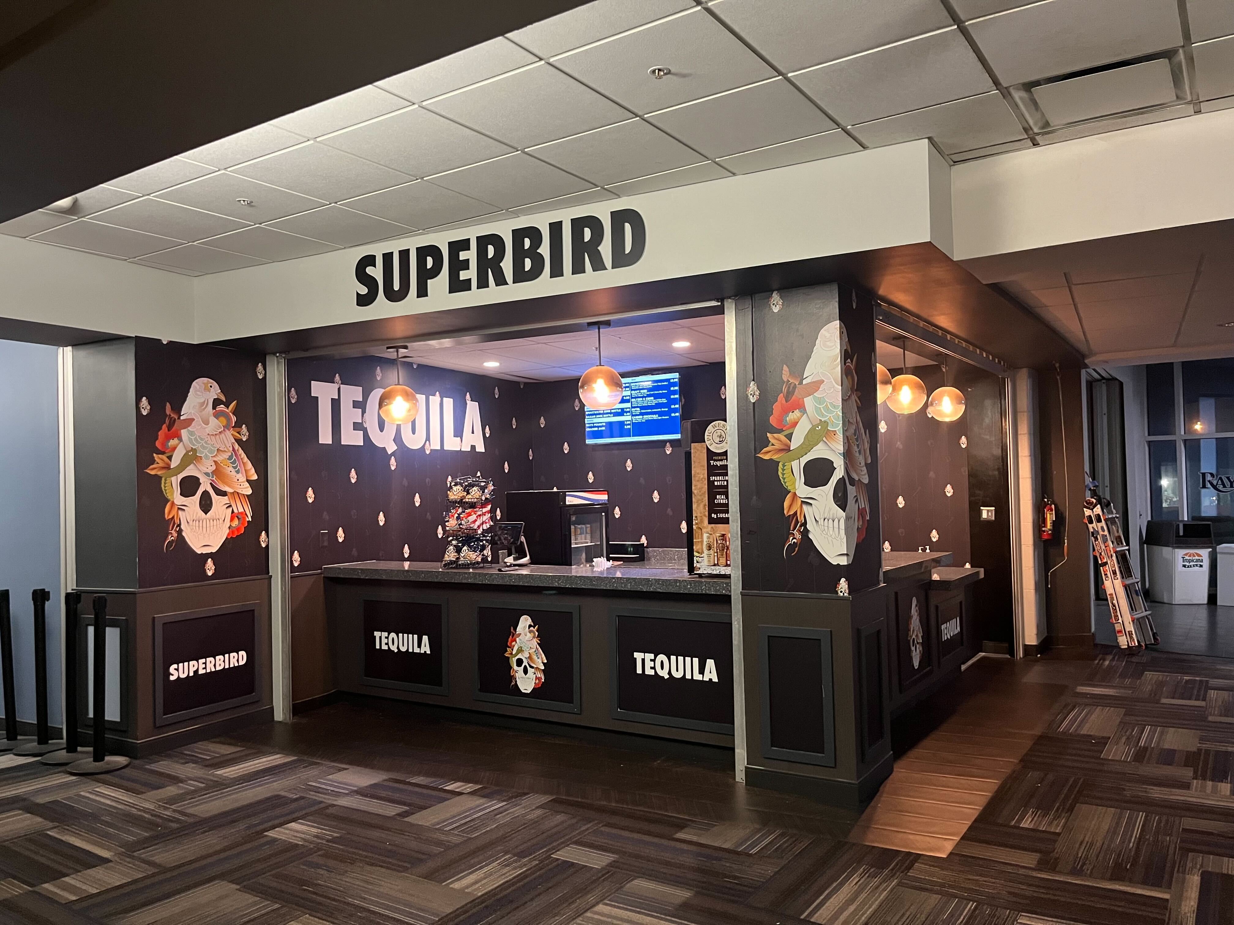
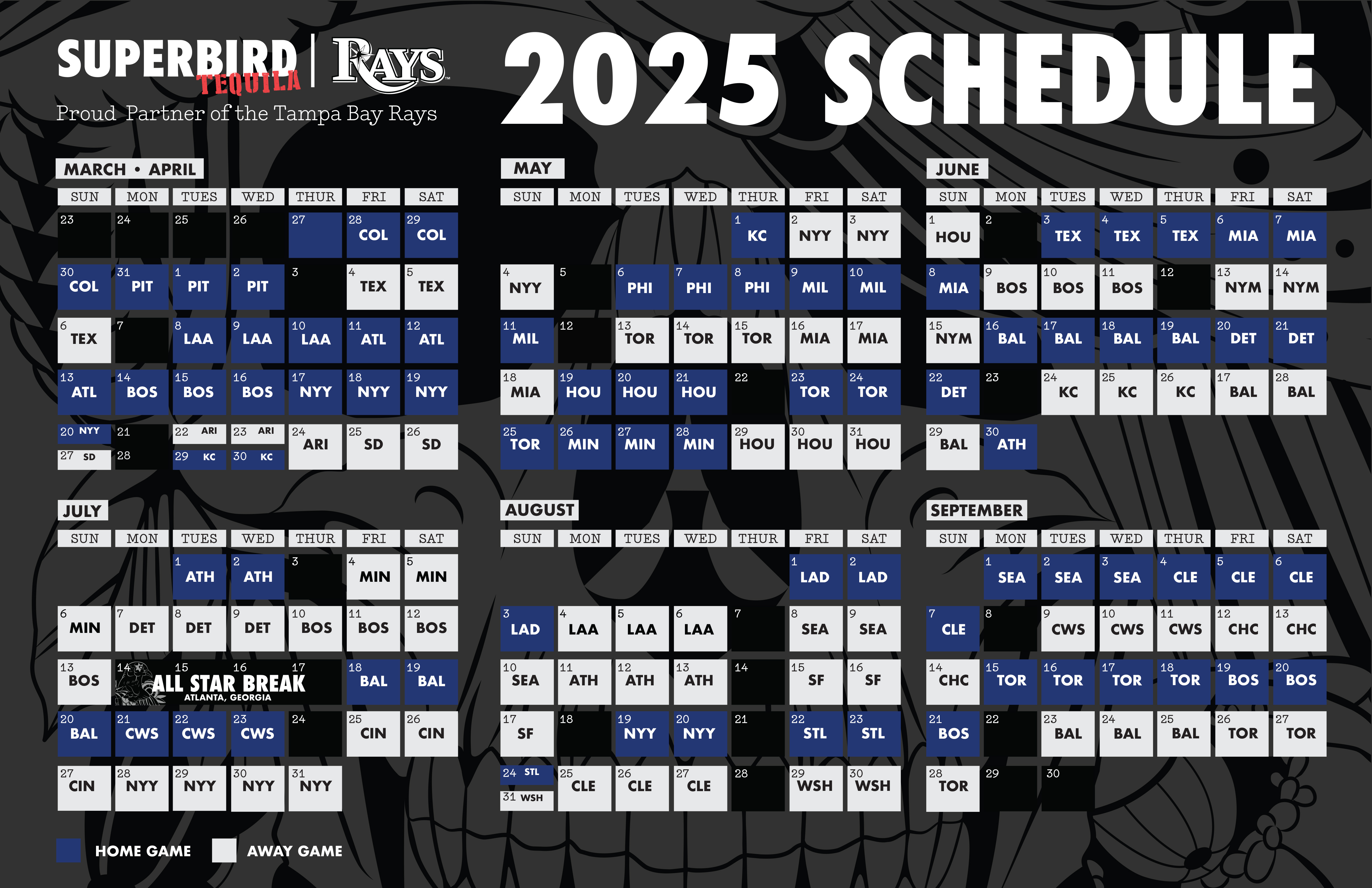
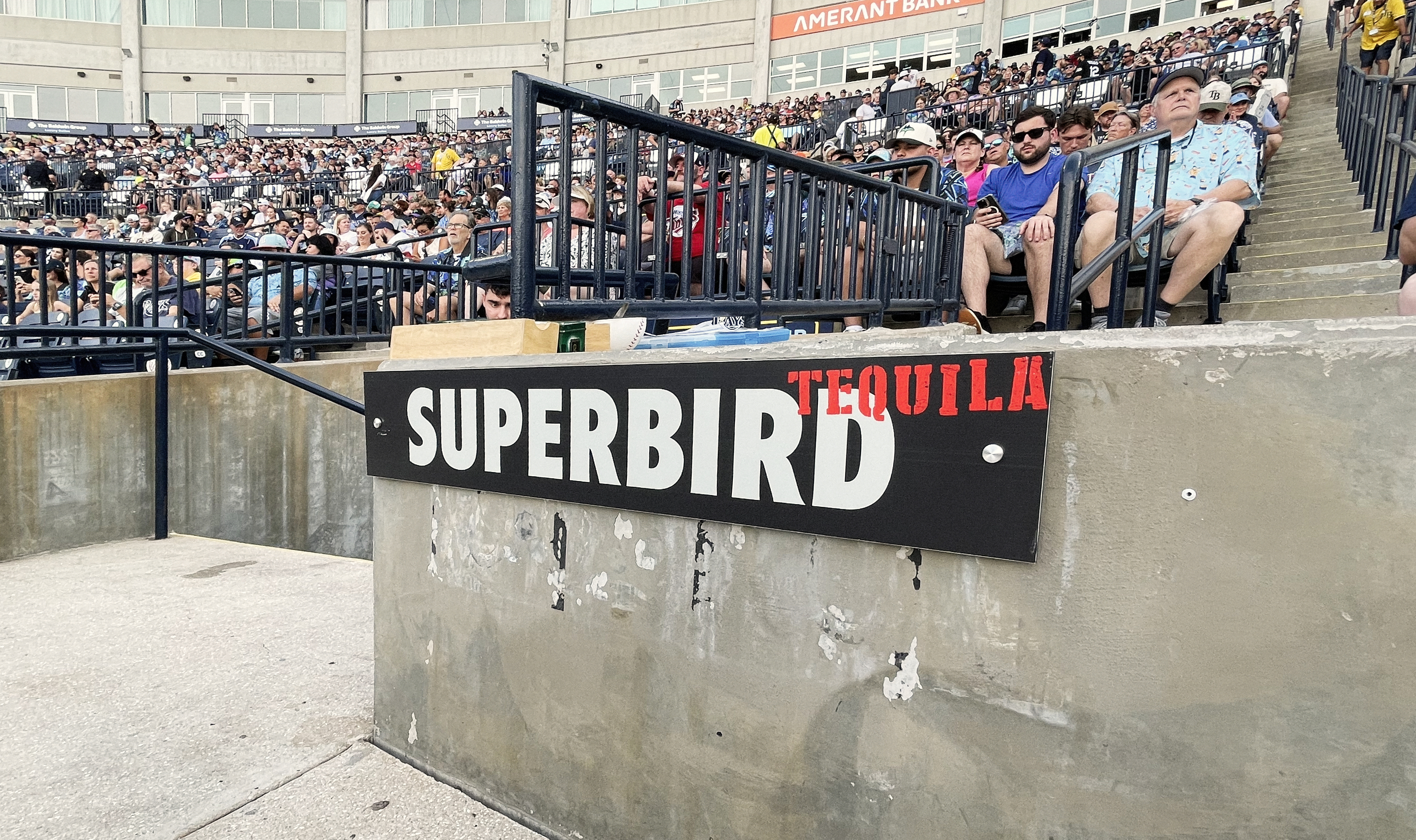
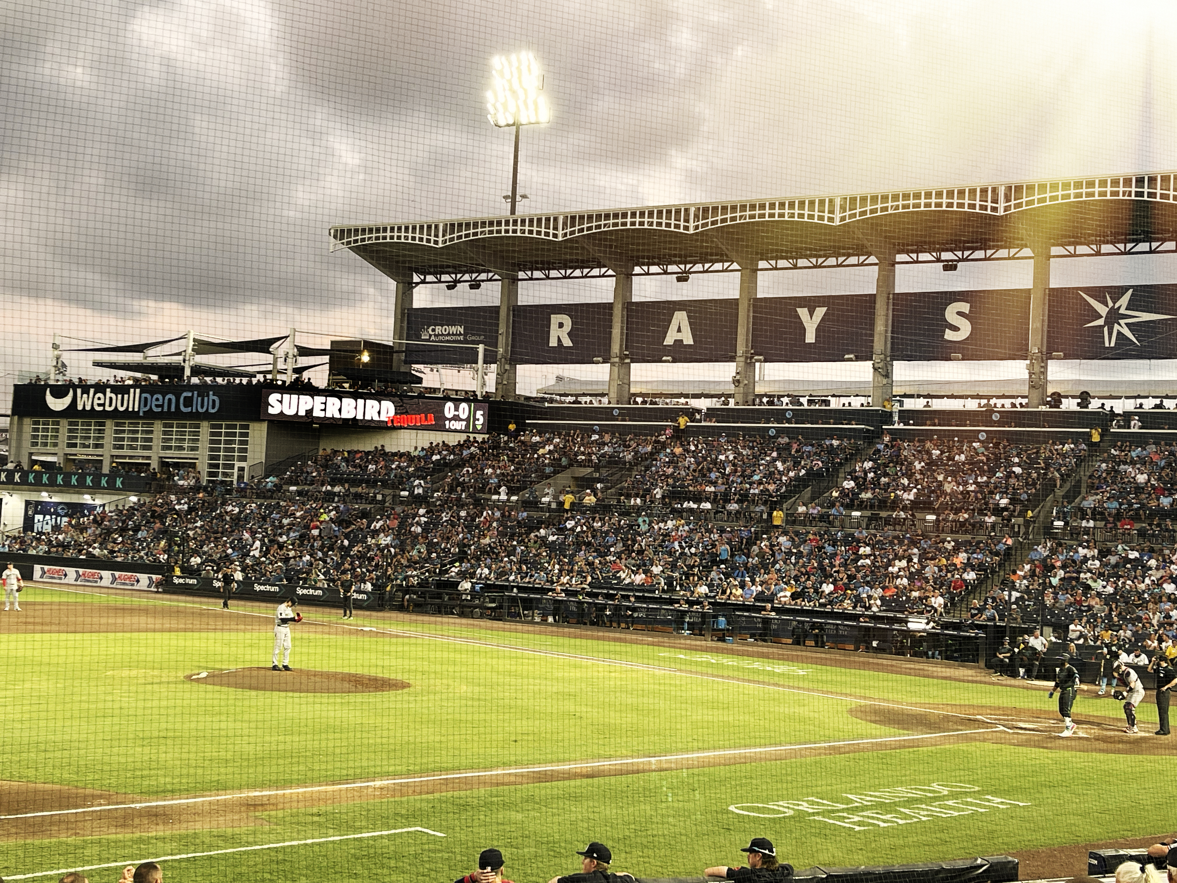
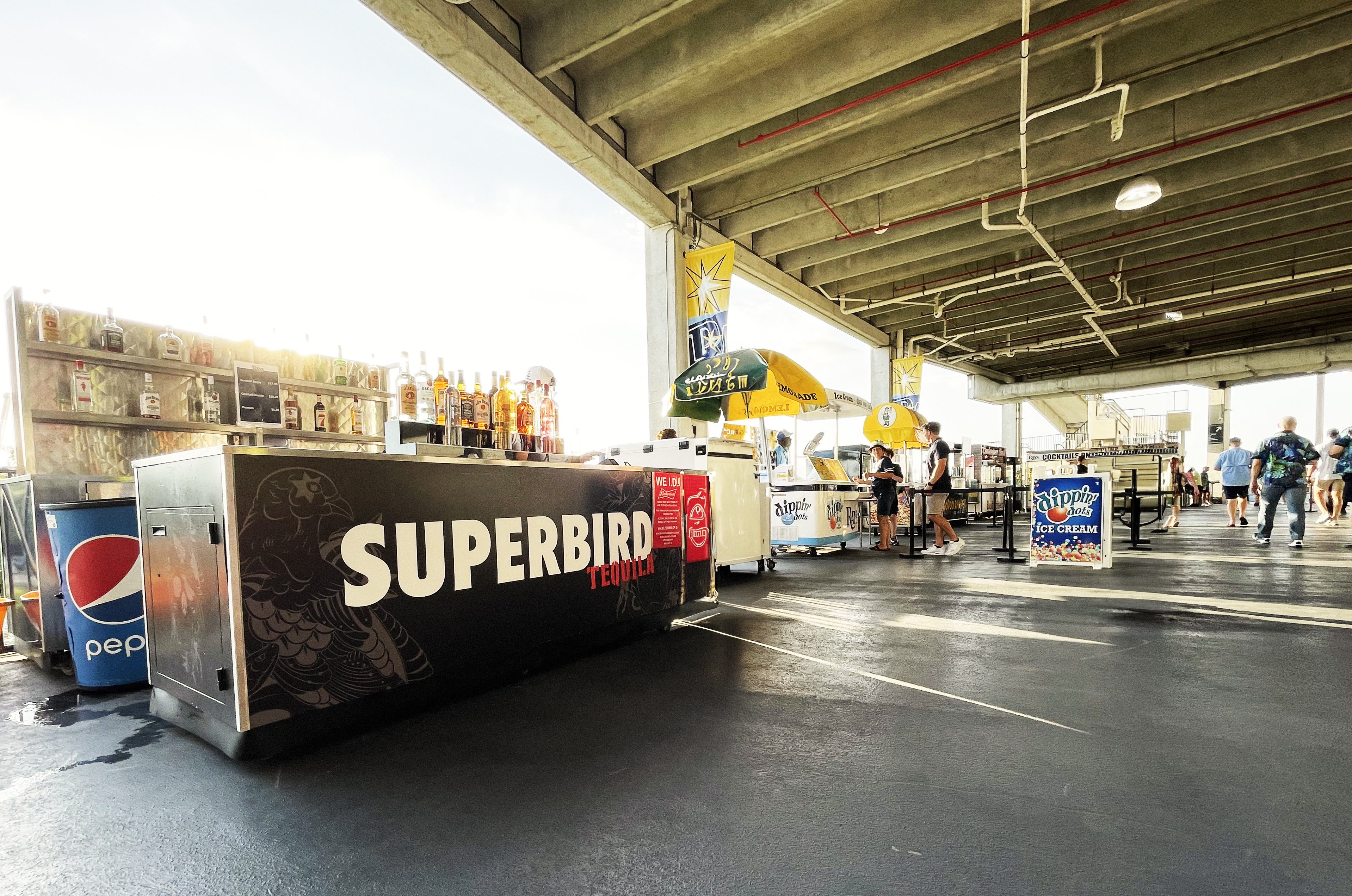
Superbird is the official tequila sponsor of the Tampa Bay Rays, we created co branded bars, campaigns, and a sweepstakes to draw attention to the partnership. The below is a baseball card themed campaign supporting the sweepstakes, with baseball cards for each offering, as well as the pop up on the drinksuperbird.com website, which drove customers to learn about our product. For this I did the art direction, ideation and photography.The Tampa Bay Rays partnership allowed us to design work within the stadium and on the trucks. Superbird reached various different touchpoints in the stadium and on the schedule. To design the bar we used illustrations we commisioned to create a lounge-like wallpaper. 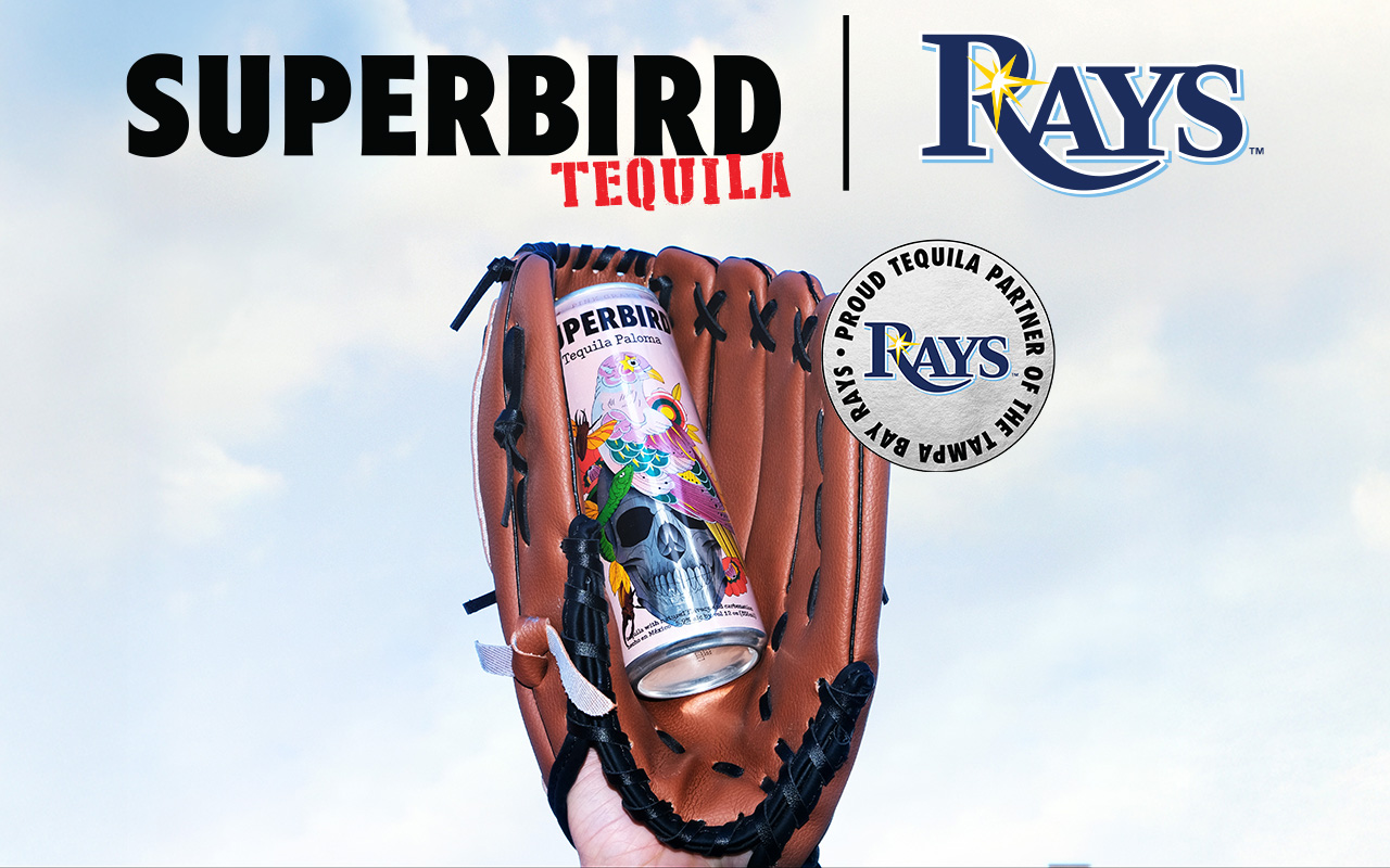
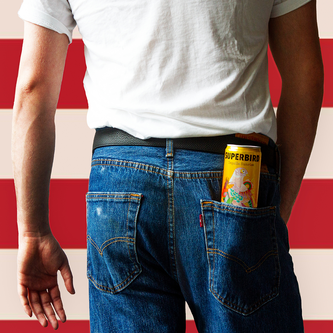
JULY FOURTH
to celebrate the 4th of July I searched for the right concept for 4th of July and landed on Bruce Springsteen’s Born in the USA iconic imagery, I reshot the image with a can of Superbird, and came up with the tagline “red white, and blue agave” to highlight Superbird’s signature ingredient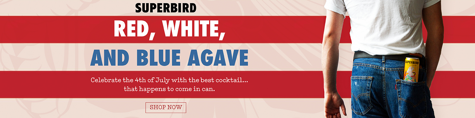
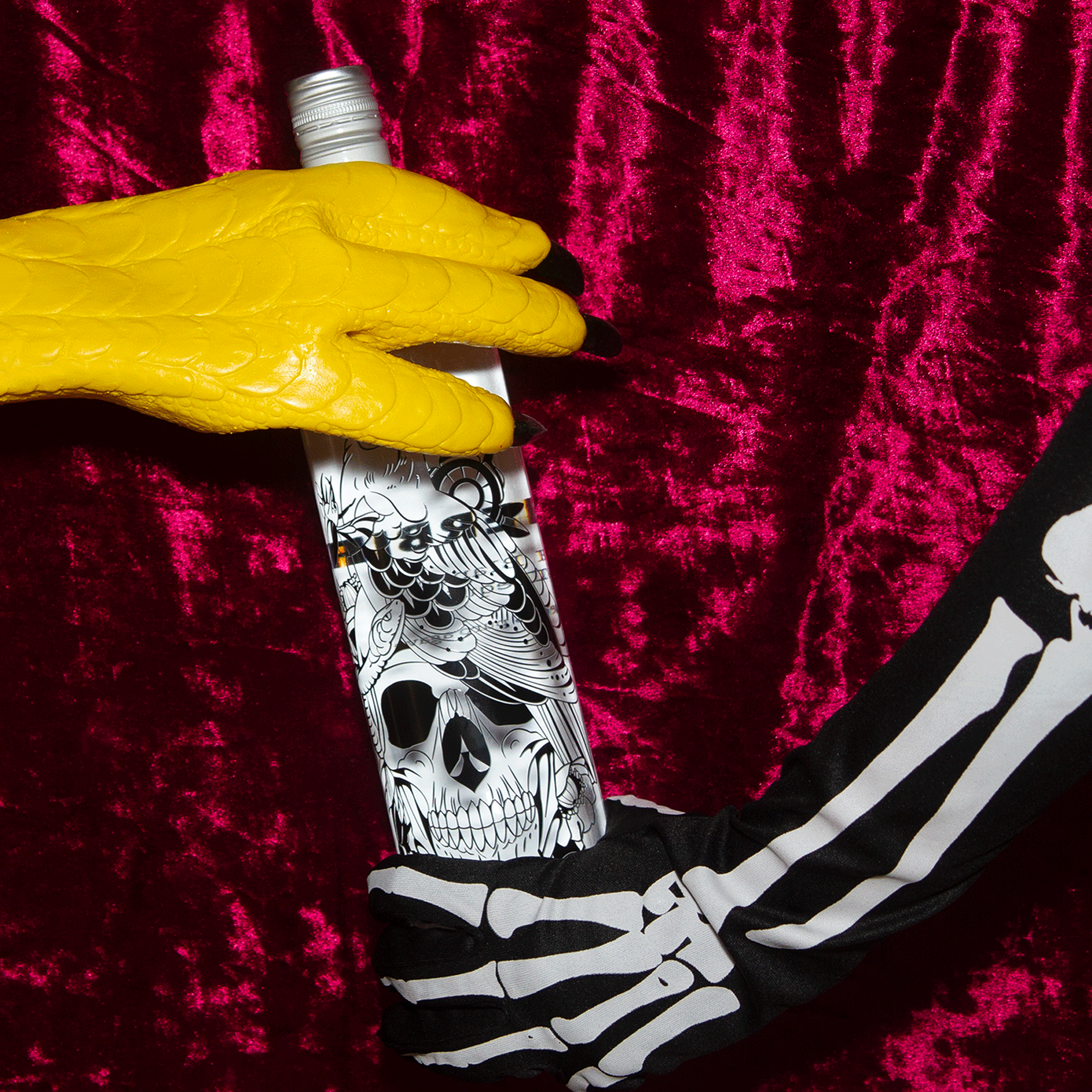
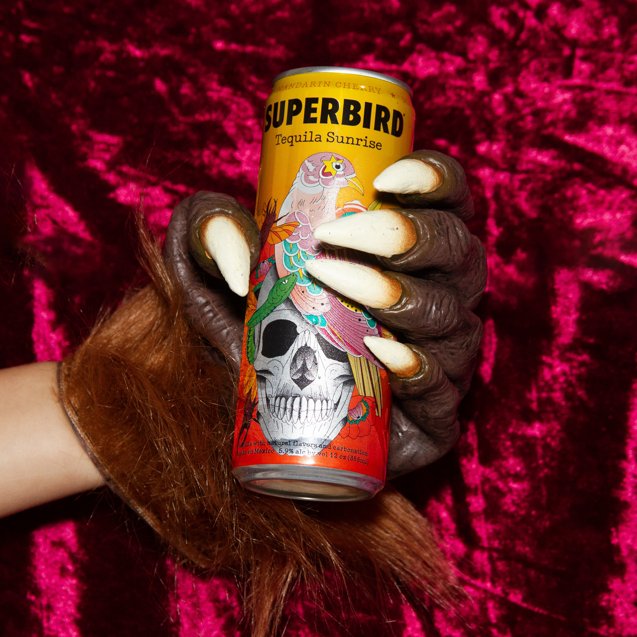
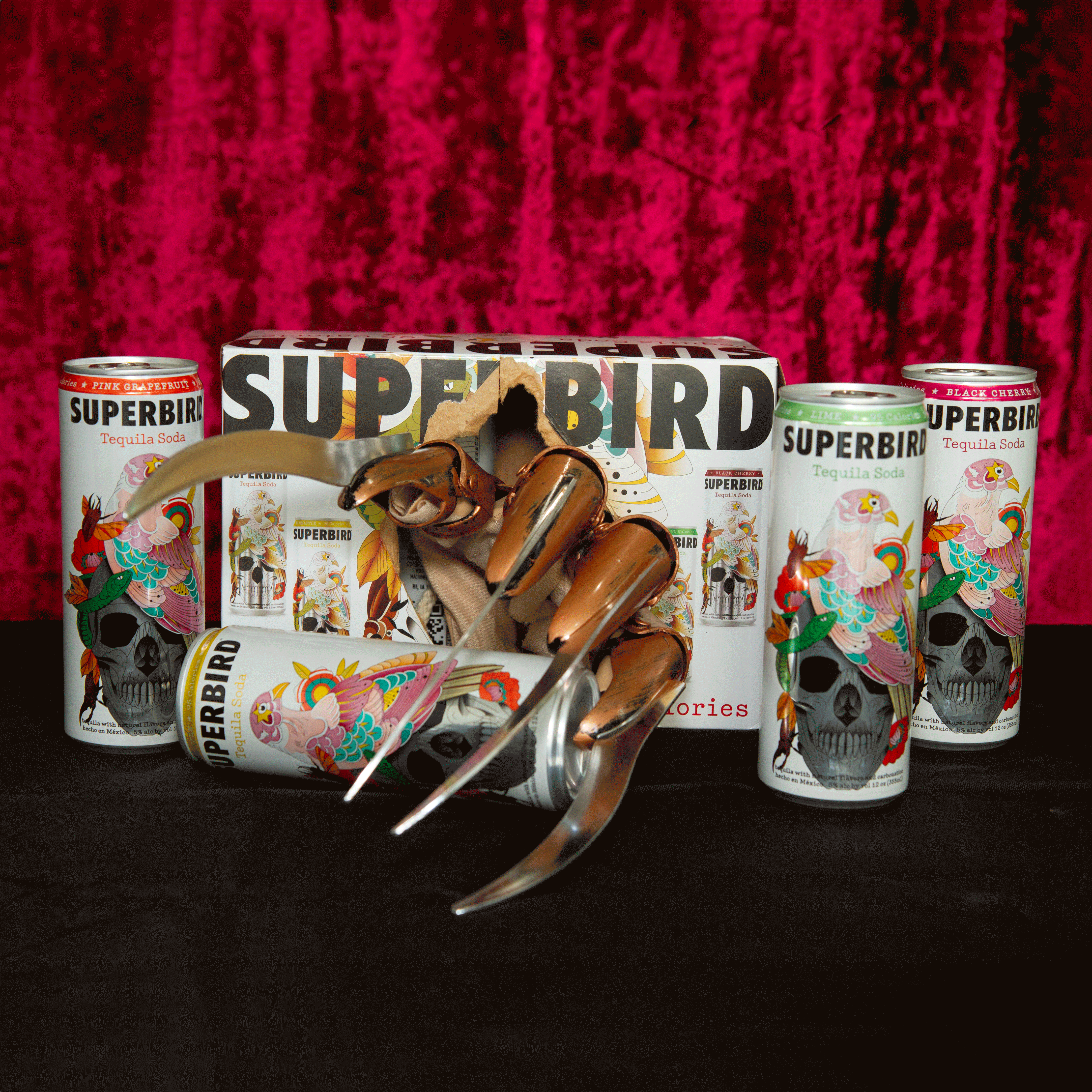
Halloween
For Halloween I was approached to do a holiday campaign shoot on a budget, and to incorporate some motion into it. Having worked with the brand for a while, I understood that I would need to do something where I would need assets available for each SKU. I leant into the idea that Superbird tastes so good that everyone wants some, and depicted everyone at the party trying to get their hands on a can or bottle.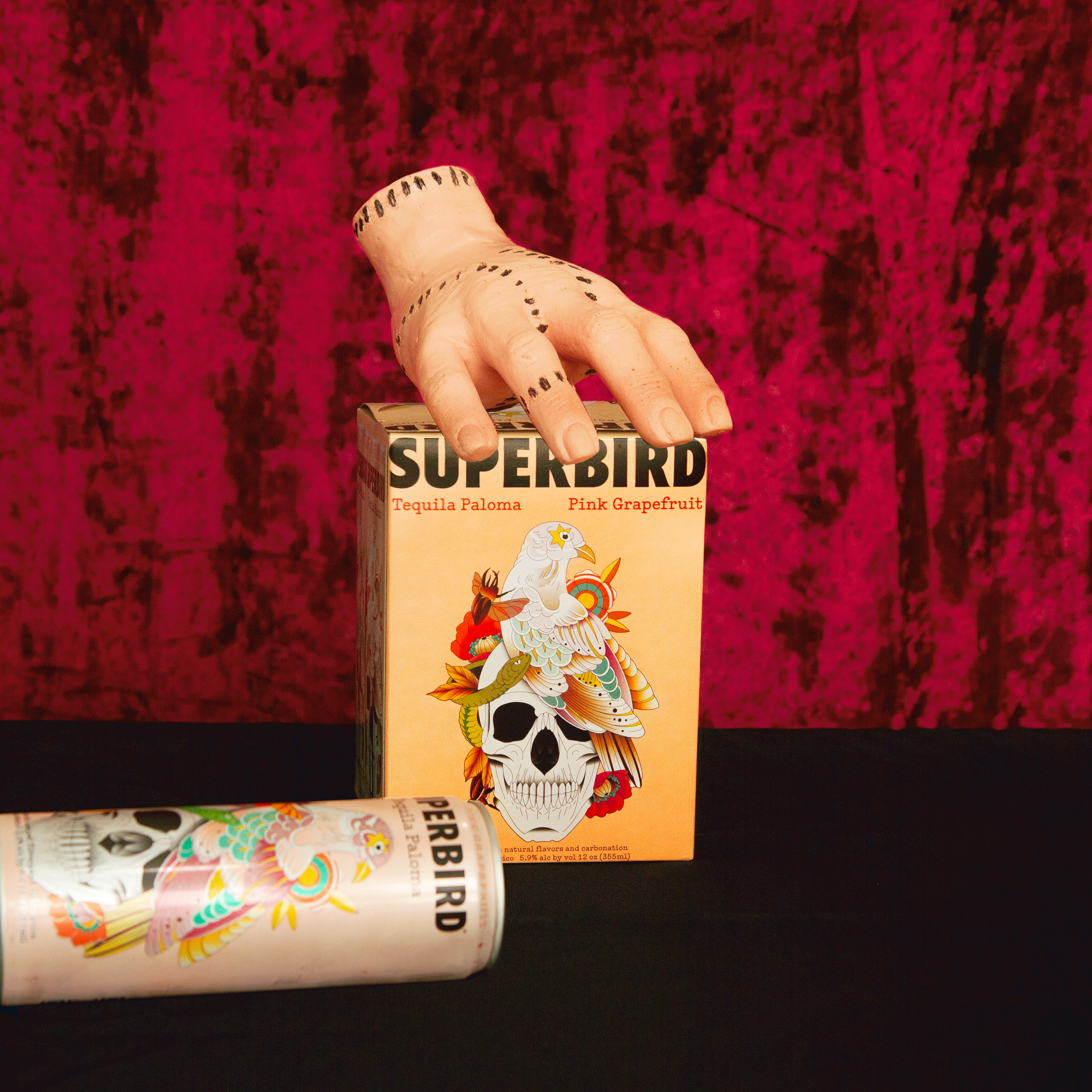

Valentines Day:
For Valentines day we were tasked with marketing Fuego, a spicy holiday deserves a spicy tequila. We used a cocktail, the Fuegorita, and a campaign image that’s a spicy twist on “will you go out with me, yes/no” Since the reccommended way of serving Fuego shots is chilled, I created “frost” for the shots and bottles. The frosted look has since been used on other marketing images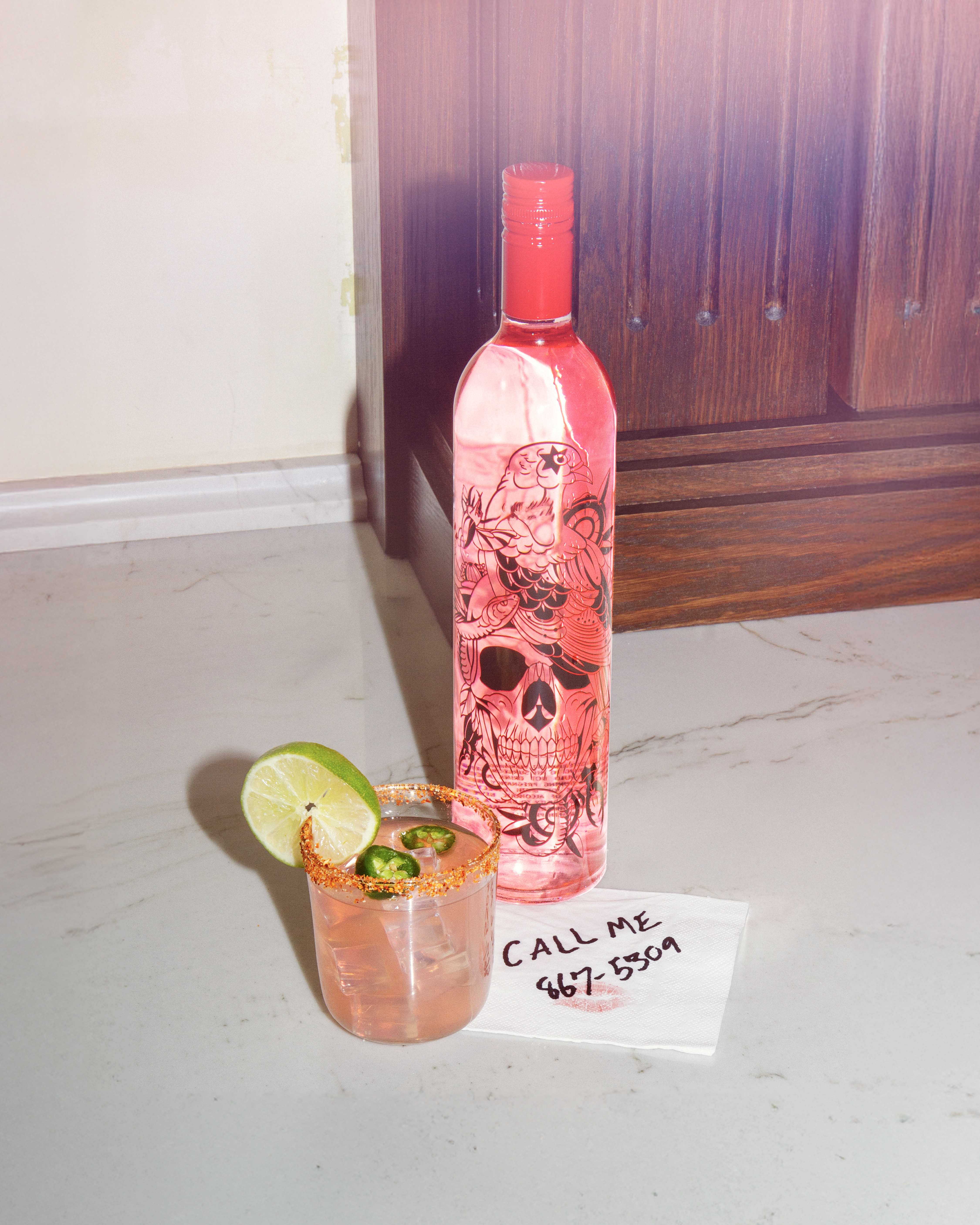

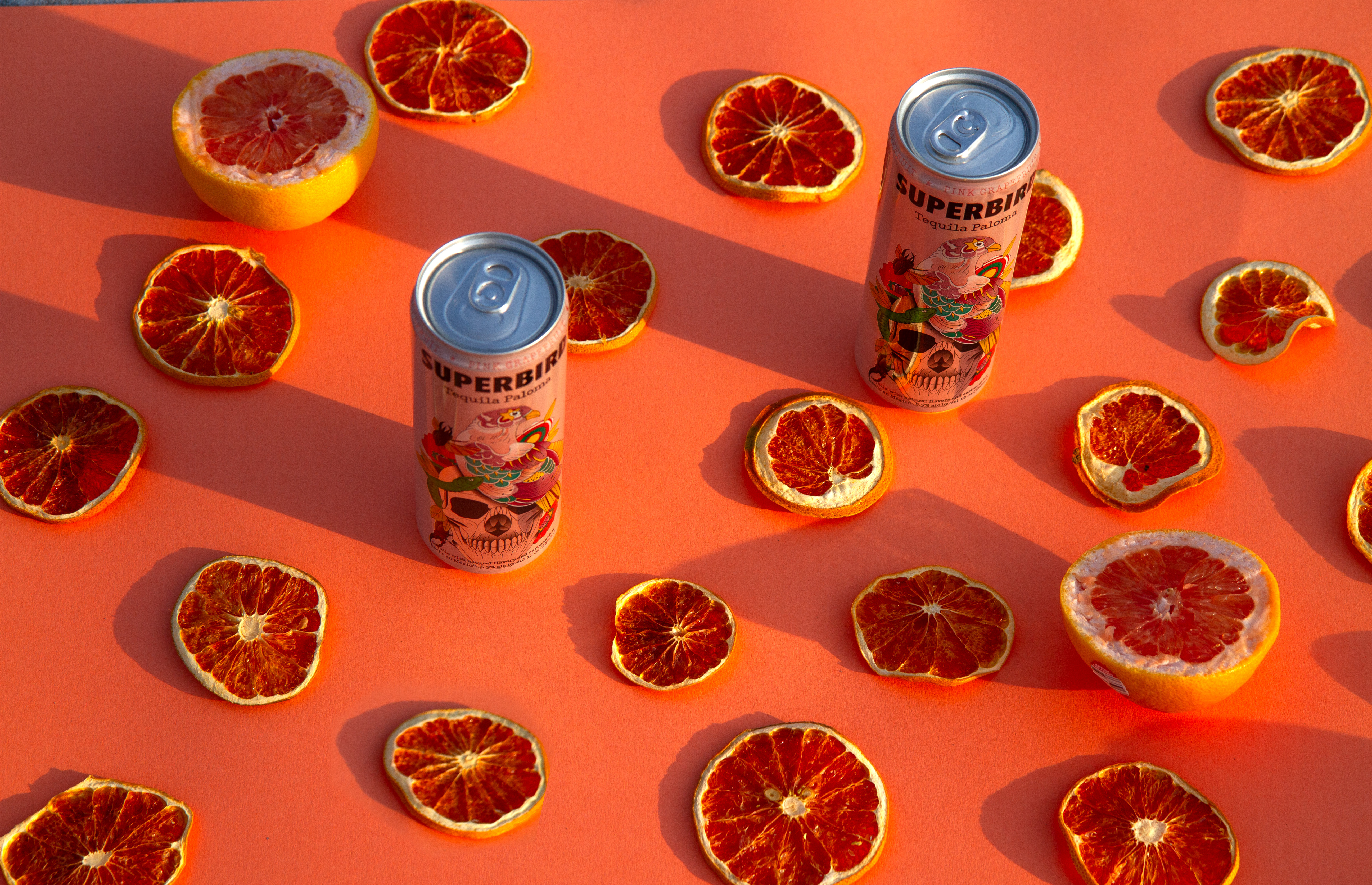
Paloma:
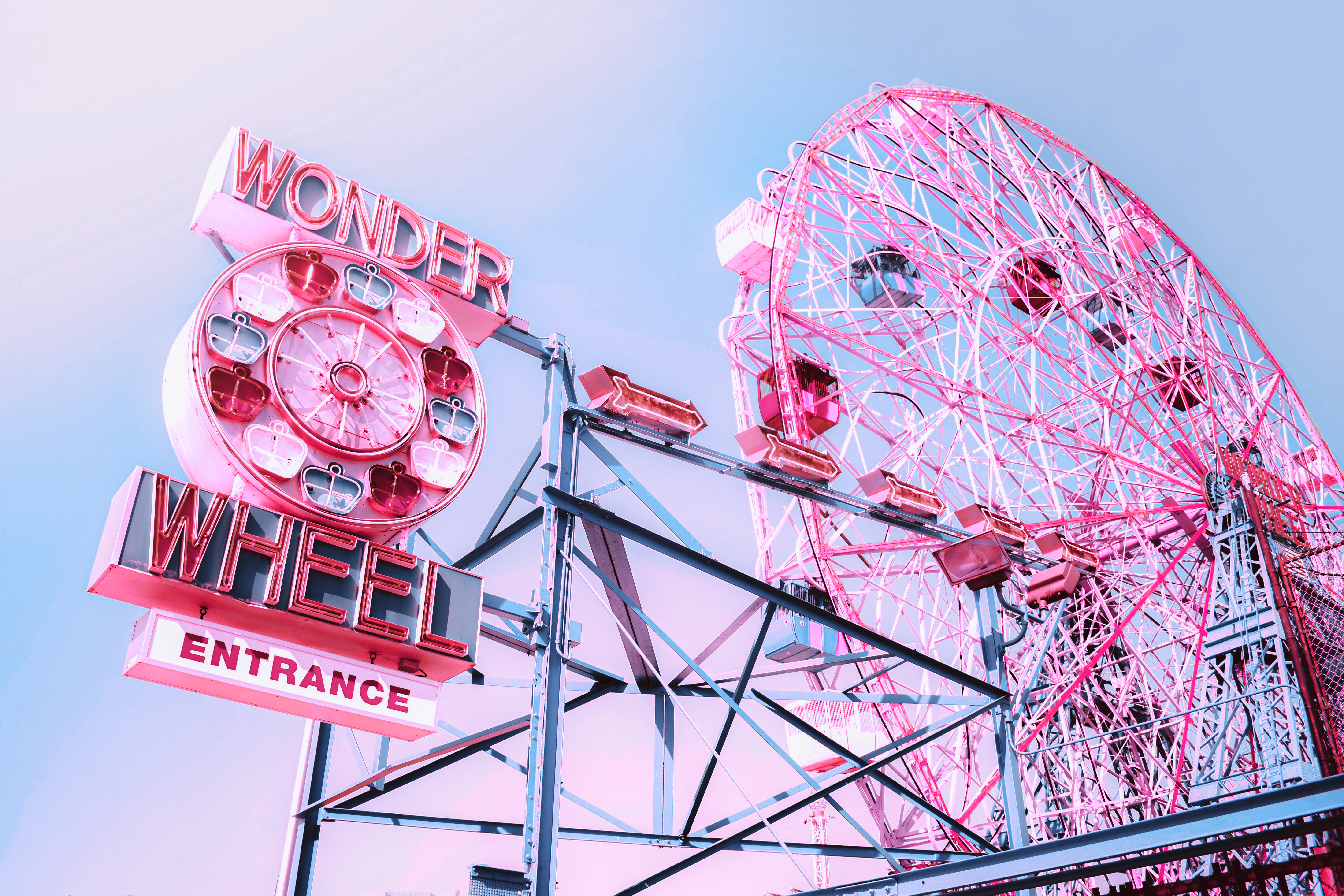
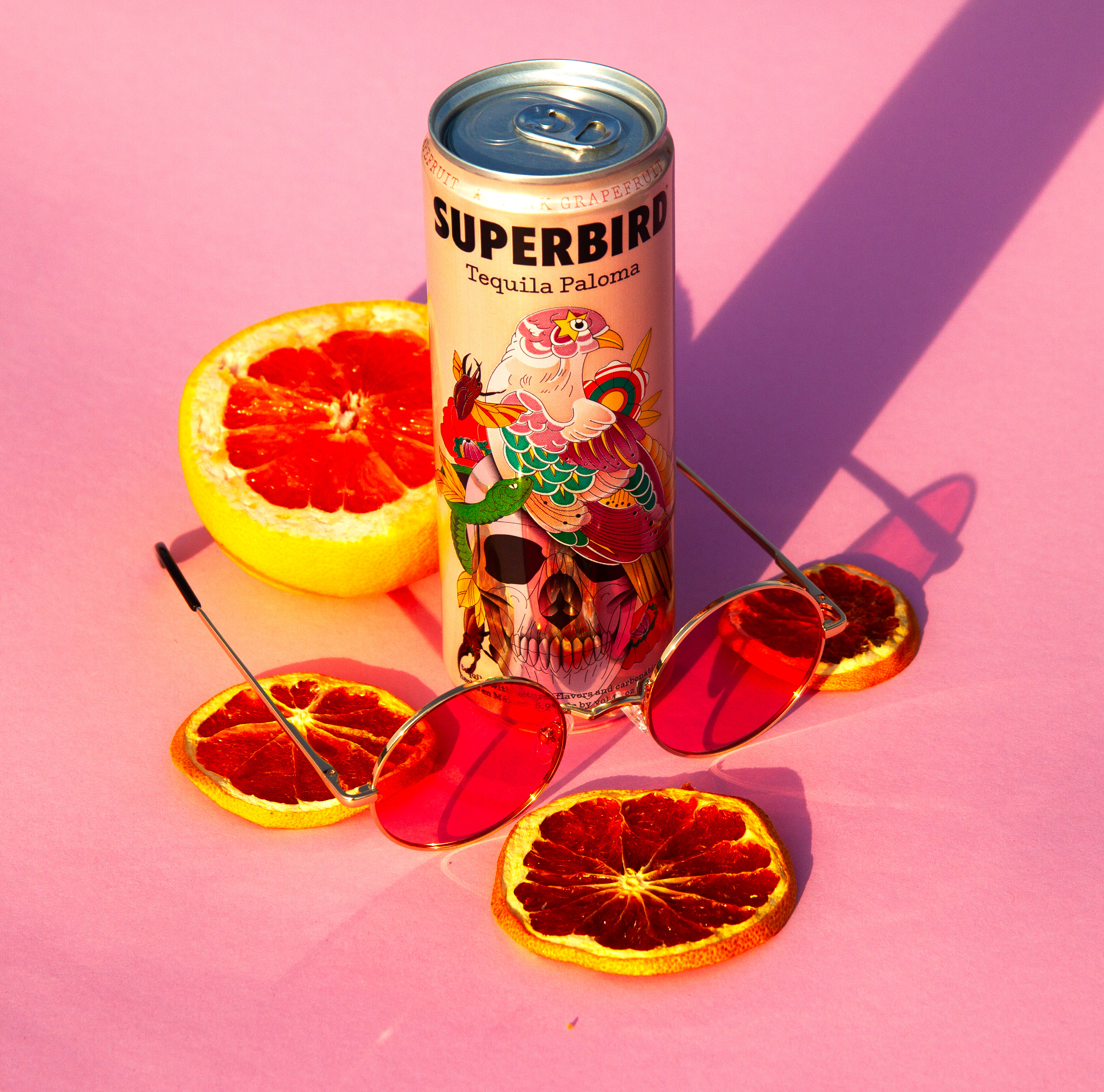
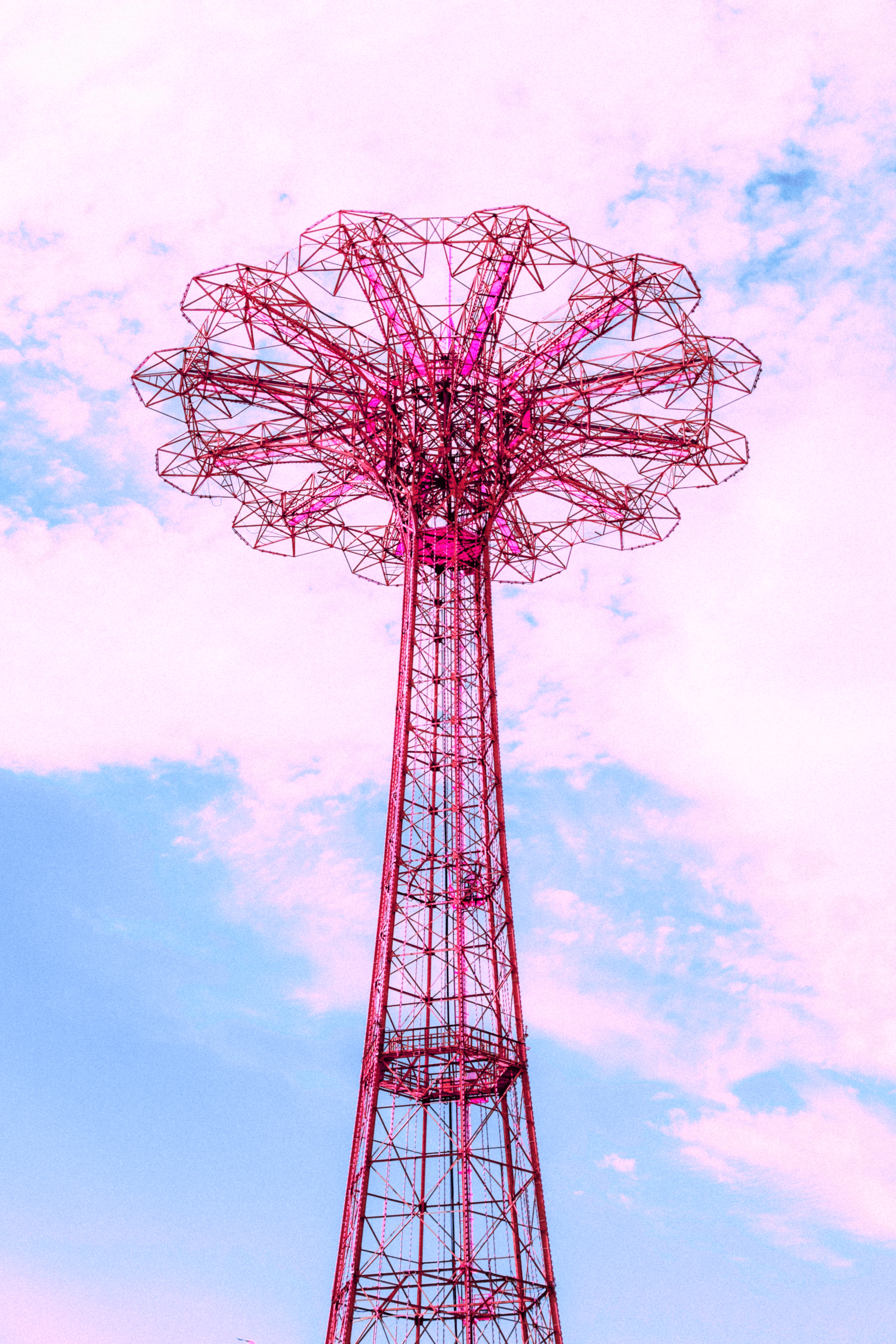
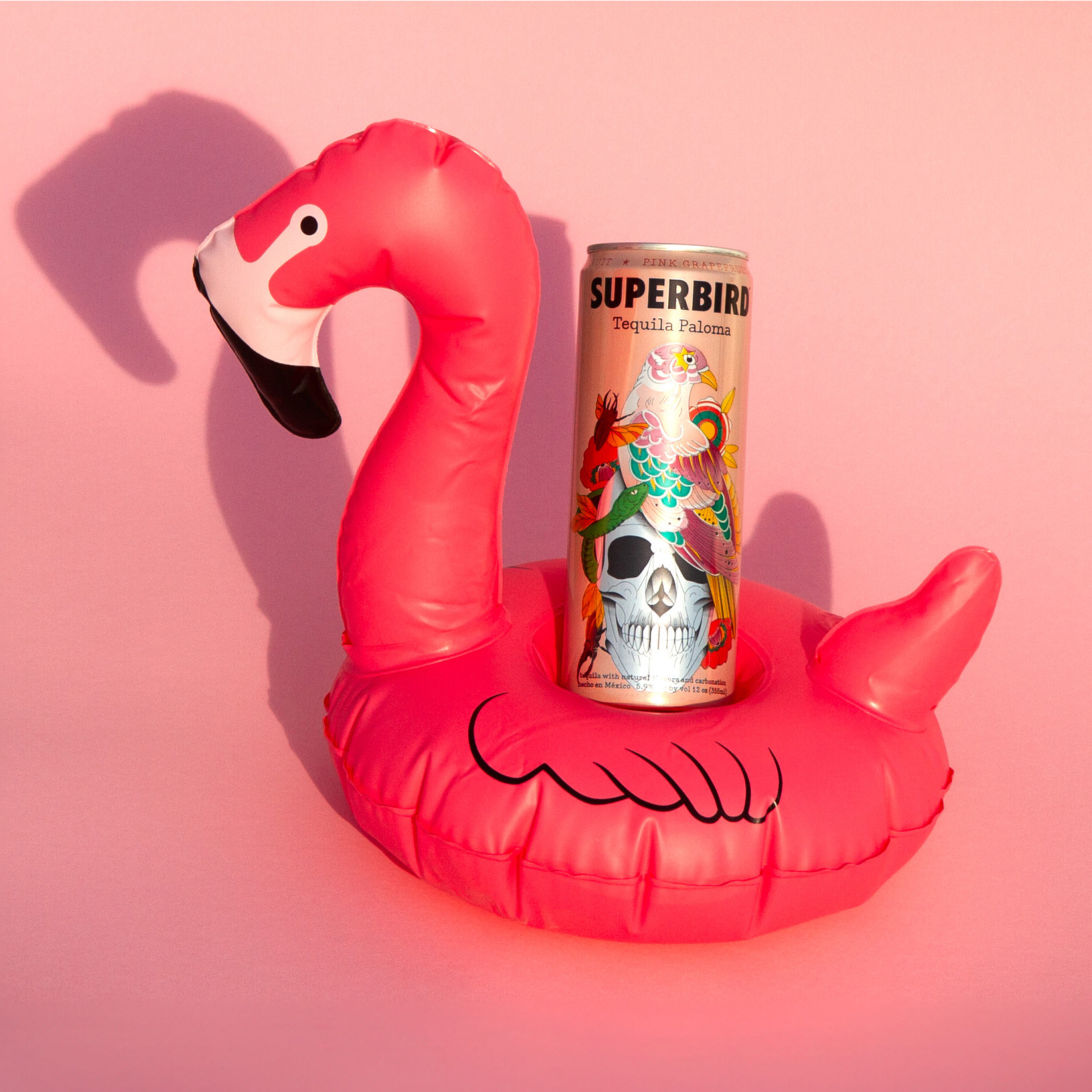
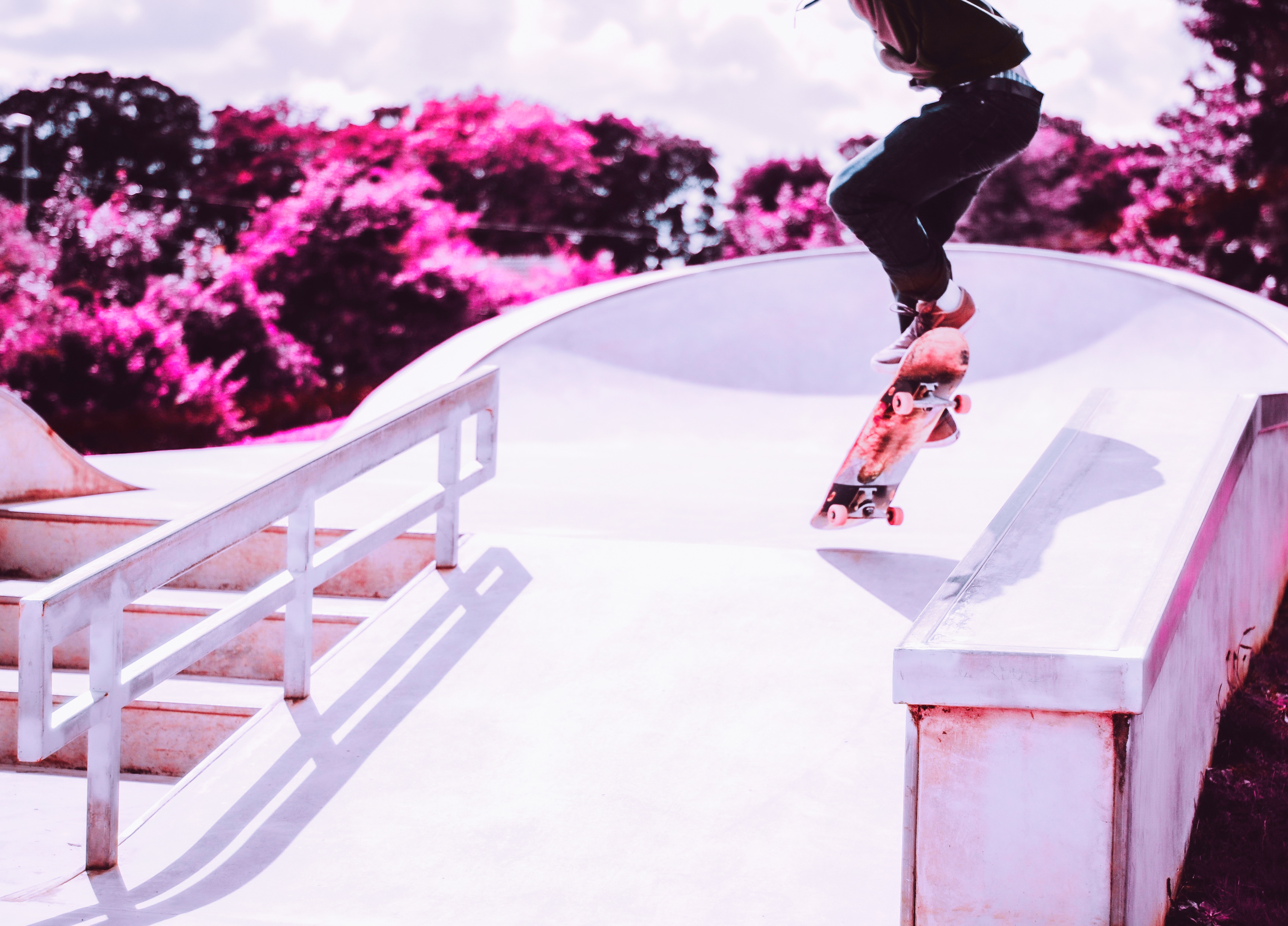
To Celebrate Superbird Paloma receiving a 96 score on ready to drink canned cocktails, I did a campaign for a Superbird Paloma. The idea was Paloma vision, with Superbird’s Paloma you see the world in Rose colored glasses, and also highlighting the fresh grapefruit in the can. I also curated a series of lifestyle photos and used an infrared image treatment to show the “rose colored glasses” view of the world when drinking Superbird Paloma in the Summer. This wound up being an Instagram takeover leading up to National Paloma Day on May 22.
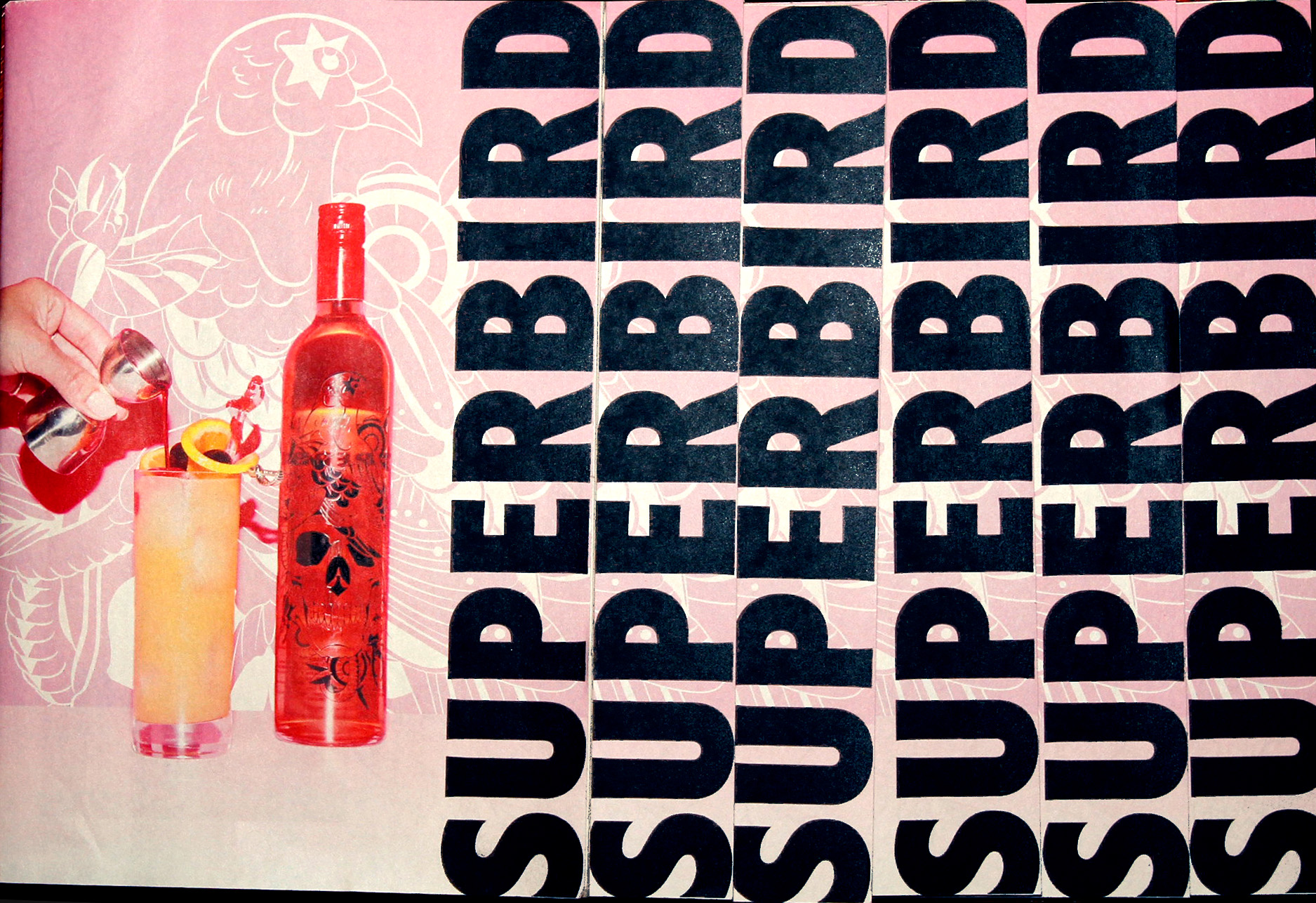
Superbird cocktail zine
A tabloid printed cocktail book for Superbird tequila, showcasing the range of drinks that can be made with our different offerings. The zine takes inspiration from tabloids and zines, integrating Superbird’s different branding elements and illustrations

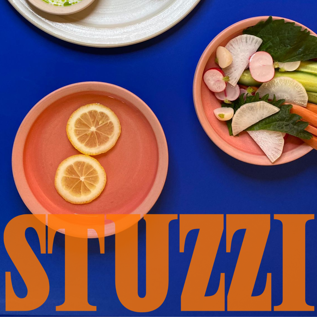
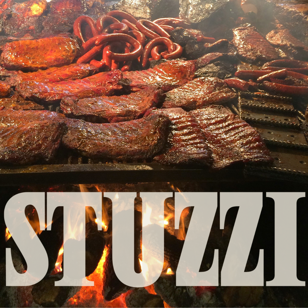
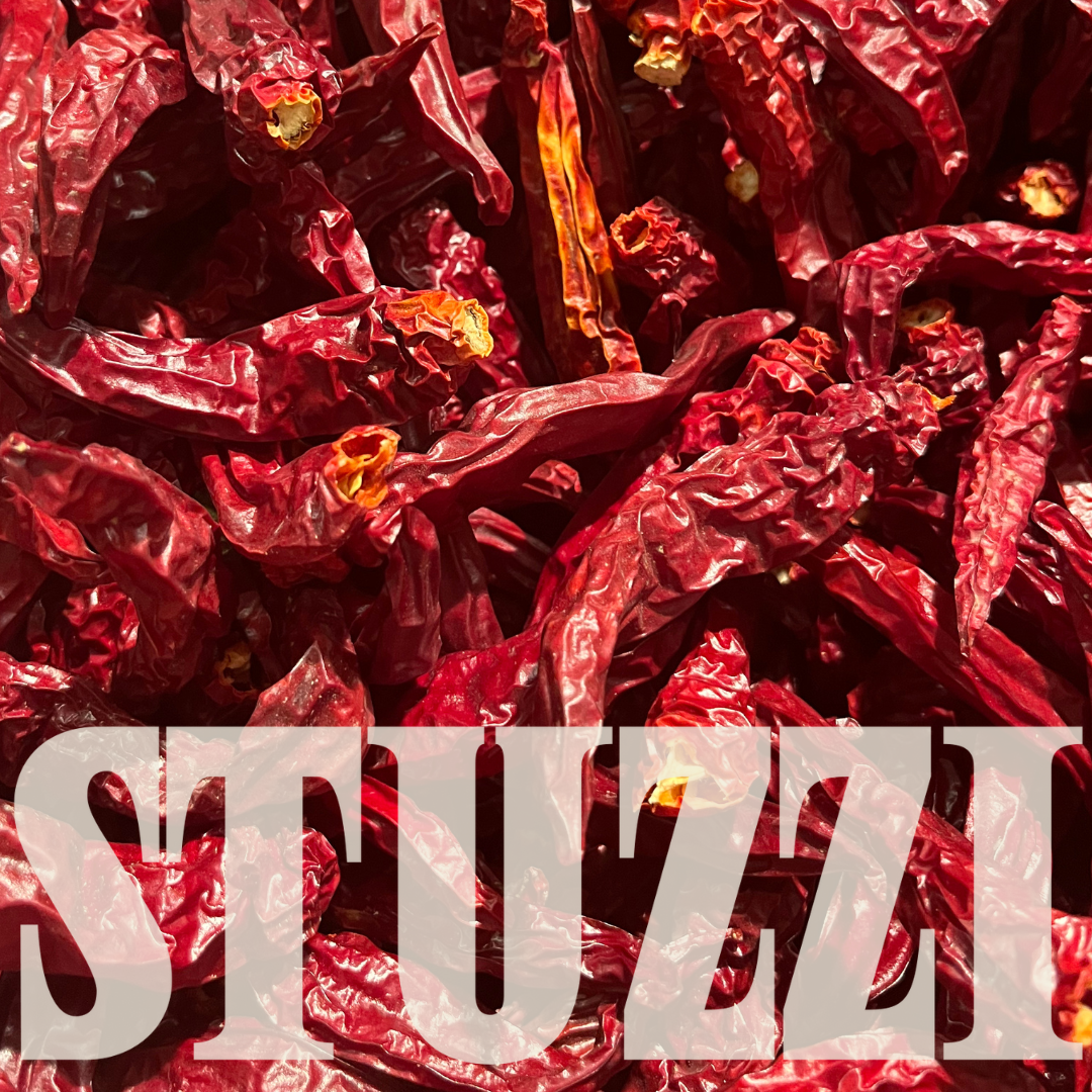
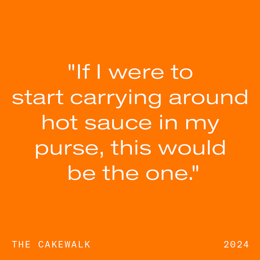
Stuzzi
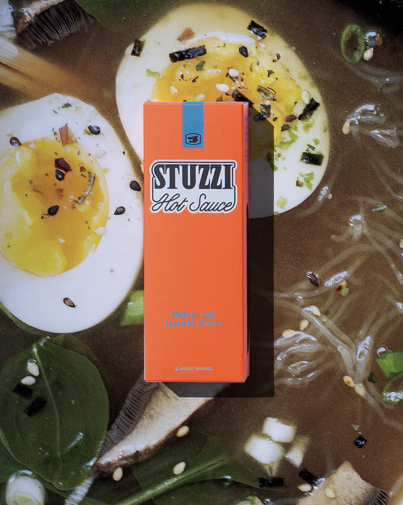
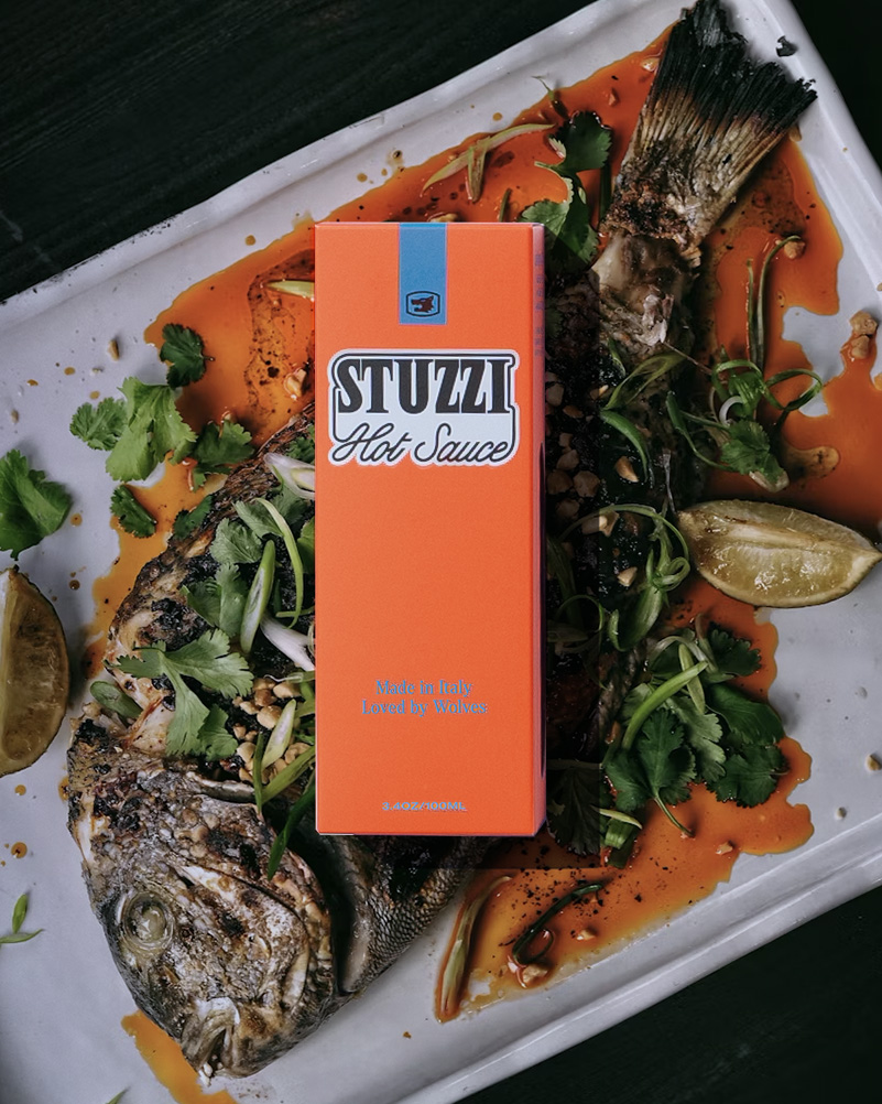
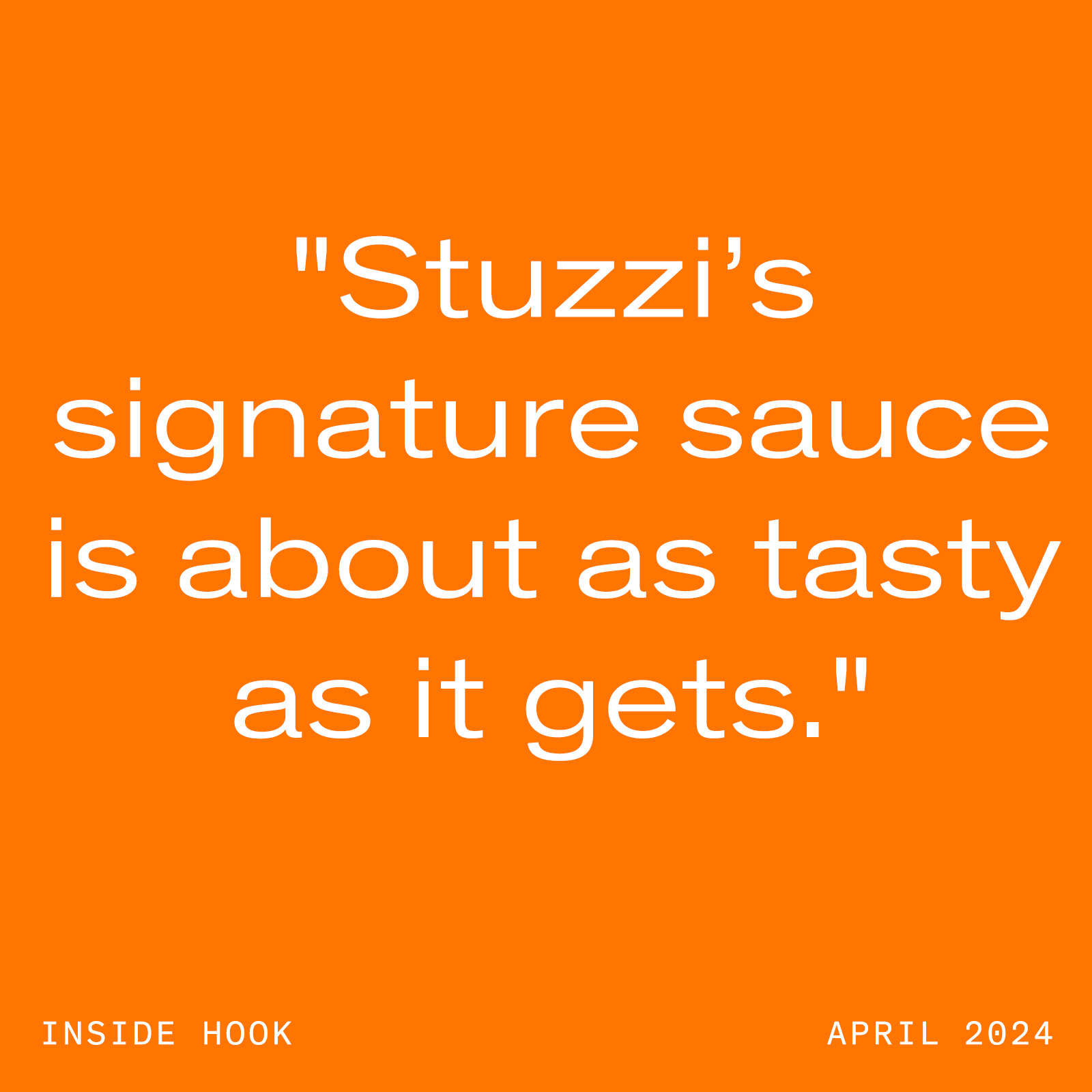
Stuzzi is a high-end hot sauce that is informed by both modern luxury and classic Italian sensibilities. For the launch of their brand and digital presence, we created a collection of images that show off bottle itself , the world it lives in, and the traditional roots that ground Stuzzi's commitment to quality.Instagram Stories and posts
For the instagram, we have been working to find a blend of articulating the high quality luxury brand of stuzzi, while also expressing it’s authenticity, and not making it look overly polished. We achieved that by displaying our brand elements, in the form of the logotype and lockup, as well as simple quote posts, along with photos of the peppers in the field, and drying in their signature process, visualizing Stuzzis blend of luxury and authenticity. I also photographed a box of Stuzzi against a background that can be changed, showing how it can go anywhere. The founder originally carried a chili with them, in case they needed spice and an aerial shot of the box almost looks like a postcard of Stuzzis travels among all dishes.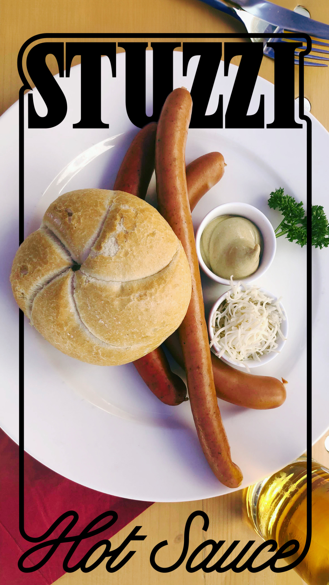


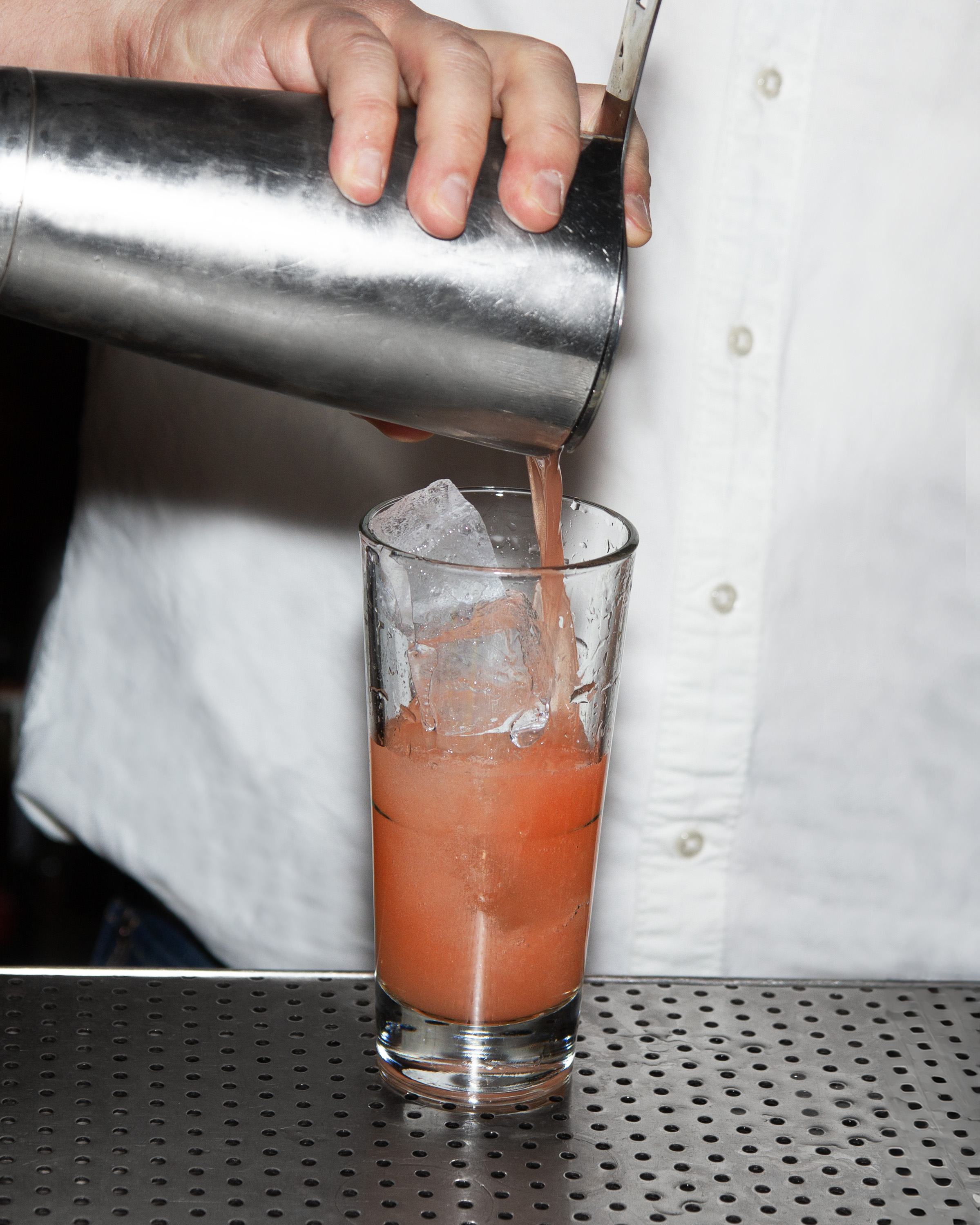
Doladira
Doladira is an Italian Alps inspired aperitif with the freshest ingredients sourced from the Italian Dolomites. One of its notable features is that it has 60% less sugar than the leading apertivo (Campari or Aperol). It has the ambitious goal of bringing European aperitivo culture to the US. To boost awareness of the knowledge of the apertivo we have been doing bartender and cocktail profiles on instagram to highlight their uses and boost awareness of the brand, bars, and drinks.Brand Guidelines

bartender profile and photography // collaboration with january spirits
![]()
![]()
![]()
![]()
![]()
![]()


Casa Komos Brands Group
This past holiday season I was tasked with designing the holiday cards for the company. We have four brands in house and wanted to celebrate all of them, while also creating a non-denominational holiday card. I was given freedom to come up with whatever concept worked, and told it could use one effect (I chose foil). Since there are custom logotypes for each brand I created snowflakes for each of the brands out of the letterforms in the logos. 